So, what can two dollars and a buttload of patience get you on a cold and snowy day? Insight into the consumerist conspiracy on coffee, a warm place to hide, a way to meet new people and a whole buttload of People Soup to sketch.
Seriously, it's like a parade of locals that hide during the daylight hours because of their cartoonish freakishness and don't let the people who appreciate the way that they move or look see them to put them down on paper. Oh, and the coffee and hot chocolate are cheap too.
I was having some creative blockage occur while working on some freelance things that will hopefully pay off big in the near future, when I'd decided to try and visit a local coffee house in order to check out the flow of the locals and see what I could sketch from that. Maybe get my hand to loosen up, and find some inspiration, you know? Super Steven Silver style, my friends!
I can't get through the Keri model sheet that I'd started a few days ago, and looking at some real people would've helped. Or so I thought.
I did wind up seeing a local politican, who'd asked for my contact information for some upcoming projects he'd had in mind in the future. (He'd totally forgotten that he'd met me, knew me and I had to remind him of that at the end of our conversation by mentioning how much weight he'd put on.) The owner of a damned good local bakery that'd made the best creme filled doughnuts I'd ever tasted. (Don't worry, she's looking for a new place to re-open because the old town she was in wouldn't let her put in a drive-thru and practically forced her out of business.) Not to mention, a few locals that were dying to be sketched.
I guess I'm writing this as a mea culpa for both not posting in so long and for not posting any new sketches as of late. I'll have some new stuff on one of my other blogs in the next few days, in regards to my freelance projects, and hopefully some sketches of the people soup. As for this blog, I need to clean up some of the new logos that I've sketched out while wating to use this computer at the local library, as my household internet access has been disconnected for a bit and finish up my Keri model sheet.
Until then, please enjoy what I've got posted so far, and I'll keep writing and researching other writers, artists and sketching!
Cheers!
Thursday, January 29, 2009
Thursday, January 8, 2009
Nose to the Grindstone.
Amid more research and sketching, I'm finding love and inspiration.
I looked in my bookshelf at the bright cyan toned spine of my Craig Thompson trade paperback Blankets. Remembered how good it was; the linework, the storyline, all of it and popped it open. Inspiration. I have to, HAVE TO work more on my sketches for HOH! Then, I perused my RSS feeds for online strips and saw that there was a new post for Nothing Better by Tyler Page. Now, I'm not a religious man, but I am a spiritual one. This web comic really, I mean REALLY speaks to me. If you haven't read either, get off of your ass and beg, borrow, or steal(okay, don't steal, but make every possible effort to obtain) these books to get a sense of what it is that I'm rambling about. You'll see that I'm really not that off the mark in liking them.
Seriously. Now, back to my recliner and my sketchbook to pencil out some more ideas.
Oh, head's up? I'm also trying to put together a professional site that will link up to this blog and some cartoon samples that I've done. So, busy bee, off to work!
Later!
Saturday, January 3, 2009
Digging a Little Deeper
In trying to get this little plan of mine going(plan? What am I Hannibal? Is this an episode of the freaking A-Team?), I've been digging around a bit. Seeing if my idea has been done, by who and whether or not it worked out so well.
I came across a single panel done by one of my FAVORITE cartoonists in the entire world. Scott Roberts.
For those of you not in the Know, he's the brilliant genius behind Patty Cake, an amazing comic about a little Dutch-American girl and her adventures growing up with her band of friends. It's not the writing that he puts into it. Believe me, his writing is incredibly heart felt and strong, it plucks at your heartstrings and reminds you of some of the greatest(and worst) times that you as a human being have experienced as you grew into adulthood and became disillusioned with the magic of childhood.
It's not the character-based story lines that give you the feeling of truly knowing these two dimensional people that only exist on the page and not in the real world.
It's his outstanding use of his brushes and his ink work that just blows me right away. His angles are as exciting as his writing, very full of the magic and spirit of a child's world and the energy that goes into his inks not only supports that, but also magnifies it.
Enough of my fan boy critique. I wrote about him, because apparently he did a single panel called Bob the Man. It's like a better Ziggy. Picture the Six Million Dollar Man. A single panel strip gets into a rocket accident and gets rebuilt. Better, faster, stronger (and without the Daft Punk references).
I saw a little bit more into what it was that I wanted the design to be, how much work I wanted to put into it and how much heart it should have.
This was great, because I was in the process of thumb nailing out logo ideas, some roughs of what I wanted the father to come across like, and jotting down notes on the other characters and some storyline and joke ideas(yeah, I've been busy with this!).
In addition to laundry, dishes, meals, phone calls, emails, job searches, follow ups to jobs, and thinking about my place in the world.
Anyway, I thought that I'd put it all out there on teh interwebs(note the pop culture reference there) and make it one step closer to a reality. If it's just in m head, then I'm the only person who can hold myself accountable. If it's out there for millions of people to see, then I HAVE/ to get it done, otherwise I'd be letting all of you down. It's easy enough to let myself down, I can just make excuses, but not the unseeing eyes of the internet! They're unforgiving and relentless.
So, just to make it one step closer, I'll post some of those sketches.
You'll note that the father character looks a lot like a certain person who . . .
it's me. Okay, it's me. We've already established that. I sketched me in a few different styles to see what would work and to try and get some emotion out of the sketches. I'm kind of new to character design, so any of you professionals out there who are reading this, feel free to light me up (Matt, I'm specifically hoping that you'll jump in here. I love what you do and how you do it, so any words of wisdom would be greatly appreciated!). I'll take any and all criticisms.
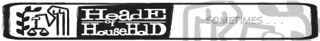
I also threw in the thumbnail of the logo. Why? Because that stuff's about all I want to show the collective you right now.
The first logo is actually the more practical of the two. I based it on the idea that you have to file as Head of Household on your annual taxes, and therefore used my version of the IRS insignia and a form of typewriter font that I hand sketched.(it'll be cleaner and better looking for the strip and digitally done before producing any of it!)
The second was just a quick idea that popped up while trying to work on this thing. I tried to fit the logo into the brain portion of the head, which is supposed to be the father. So the shape would essentially change based on the choice in characters that I would use for the strip.
I'm also looking to post some sketches of the rest of the family soon, and have to work on the parents and children. I'm leaning strongly toward the idea of the boys being twins with opposite personalities that constantly use their imagination, as the original inspiration for the baby character is only a cool fourteen months old at the end of January.
Enjoy!


I came across a single panel done by one of my FAVORITE cartoonists in the entire world. Scott Roberts.
For those of you not in the Know, he's the brilliant genius behind Patty Cake, an amazing comic about a little Dutch-American girl and her adventures growing up with her band of friends. It's not the writing that he puts into it. Believe me, his writing is incredibly heart felt and strong, it plucks at your heartstrings and reminds you of some of the greatest(and worst) times that you as a human being have experienced as you grew into adulthood and became disillusioned with the magic of childhood.
It's not the character-based story lines that give you the feeling of truly knowing these two dimensional people that only exist on the page and not in the real world.
It's his outstanding use of his brushes and his ink work that just blows me right away. His angles are as exciting as his writing, very full of the magic and spirit of a child's world and the energy that goes into his inks not only supports that, but also magnifies it.
Enough of my fan boy critique. I wrote about him, because apparently he did a single panel called Bob the Man. It's like a better Ziggy. Picture the Six Million Dollar Man. A single panel strip gets into a rocket accident and gets rebuilt. Better, faster, stronger (and without the Daft Punk references).
I saw a little bit more into what it was that I wanted the design to be, how much work I wanted to put into it and how much heart it should have.
This was great, because I was in the process of thumb nailing out logo ideas, some roughs of what I wanted the father to come across like, and jotting down notes on the other characters and some storyline and joke ideas(yeah, I've been busy with this!).
In addition to laundry, dishes, meals, phone calls, emails, job searches, follow ups to jobs, and thinking about my place in the world.
Anyway, I thought that I'd put it all out there on teh interwebs(note the pop culture reference there) and make it one step closer to a reality. If it's just in m head, then I'm the only person who can hold myself accountable. If it's out there for millions of people to see, then I HAVE/ to get it done, otherwise I'd be letting all of you down. It's easy enough to let myself down, I can just make excuses, but not the unseeing eyes of the internet! They're unforgiving and relentless.
So, just to make it one step closer, I'll post some of those sketches.
You'll note that the father character looks a lot like a certain person who . . .
it's me. Okay, it's me. We've already established that. I sketched me in a few different styles to see what would work and to try and get some emotion out of the sketches. I'm kind of new to character design, so any of you professionals out there who are reading this, feel free to light me up (Matt, I'm specifically hoping that you'll jump in here. I love what you do and how you do it, so any words of wisdom would be greatly appreciated!). I'll take any and all criticisms.
I also threw in the thumbnail of the logo. Why? Because that stuff's about all I want to show the collective you right now.
The first logo is actually the more practical of the two. I based it on the idea that you have to file as Head of Household on your annual taxes, and therefore used my version of the IRS insignia and a form of typewriter font that I hand sketched.(it'll be cleaner and better looking for the strip and digitally done before producing any of it!)
The second was just a quick idea that popped up while trying to work on this thing. I tried to fit the logo into the brain portion of the head, which is supposed to be the father. So the shape would essentially change based on the choice in characters that I would use for the strip.
I'm also looking to post some sketches of the rest of the family soon, and have to work on the parents and children. I'm leaning strongly toward the idea of the boys being twins with opposite personalities that constantly use their imagination, as the original inspiration for the baby character is only a cool fourteen months old at the end of January.
Enjoy!


Subscribe to:
Posts (Atom)